Dinality Team
The Dinality Team visual identity project challenged us to craft a brand that felt fresh and agile yet immediately trustworthy. Spun off from a well‑known cleaning group, Dinality Team needed a logo, stationery set and one‑page website that would fit hard‑working uniforms as easily as a browser tab.
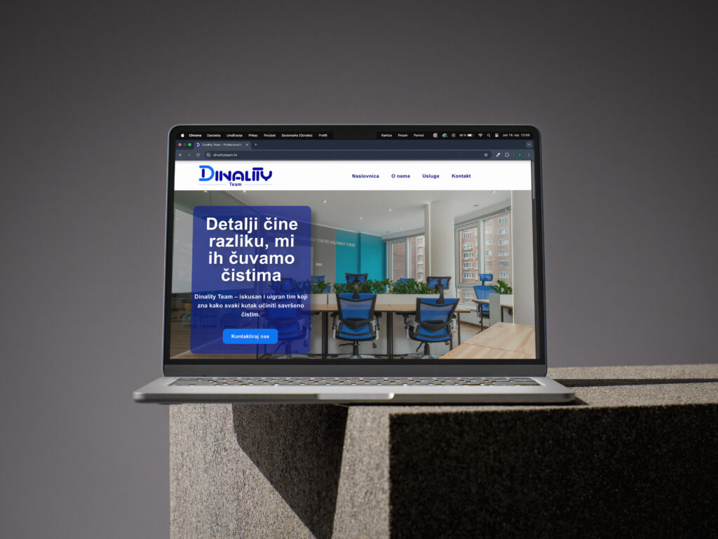
We started with a deep dive into the company’s commitment to spotless offices and satisfied clients.The result is a rounded blue “D” word‑mark whose twin tones suggest the sweep of a cleaning blade and the stability of long‑term service. From that anchor we expanded into minimalist business cards, letterheads, a custom stamp and a brushed‑aluminum office sign, all echoing the same clean geometry.
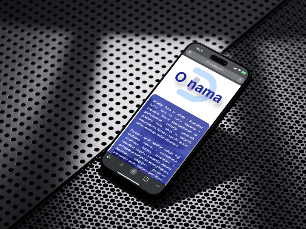
Online, we translated the identity into a lightweight WordPress one‑pager where every scroll section answers one of three questions: who we are, what we clean and how to get a quote. Built mobile‑first, the page loads in under 1 s and is fully SEO‑optimized with schema and locally targeted keywords, so the phrase Dinality Team now appears where Google—and new clients—expect it.
In short, Dinality Team visual identity and web page project turns an experienced cleaning crew into a brand that looks as polished as the spaces it maintains.