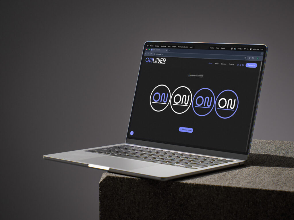
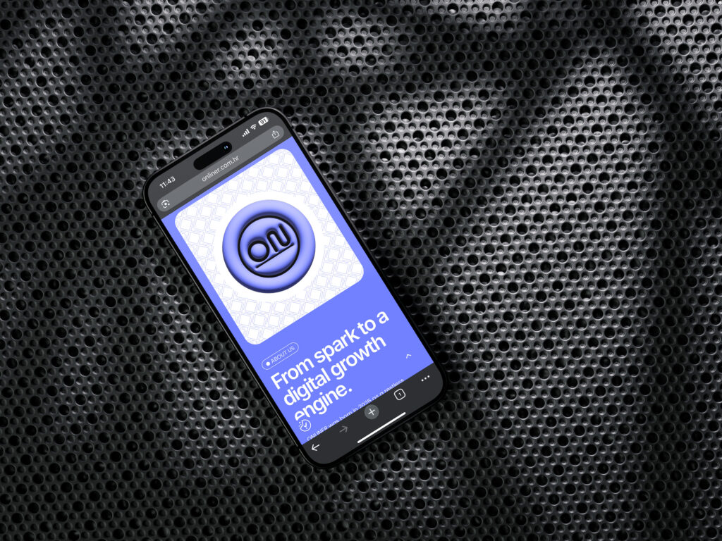
Creating visual identity for your own agency can quickly slip into vanity, so we set out to keep ONLINER both professional and playfully digital. Our logo starts with a vivid violet‑blue “ON” ligature – a visual “power on” switch – followed by a crisp black “LINER” and a thin baseline to signal reliability and precision. The proportional grid lets us spin off a circular icon for favicons & avatars, plus a secondary horizontal lock‑up for banners.
We expanded our visual identity with a three‑tone palette and a type system that pairs a futuristic grotesque for headings with a humanist sans for long‑form copy to keep everything highly legible.
The website is clean built on WordPress blocks with custom 3D touches – a floating logo and animated mock‑ups. Designed mobile‑first and SEO‑tuned.
Our social channels mirror the site’s look: black‑and‑white backgrounds, violet pop colours, a micro‑animated logo bumper and carousel posts with clear CTAs.